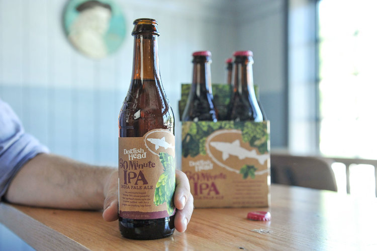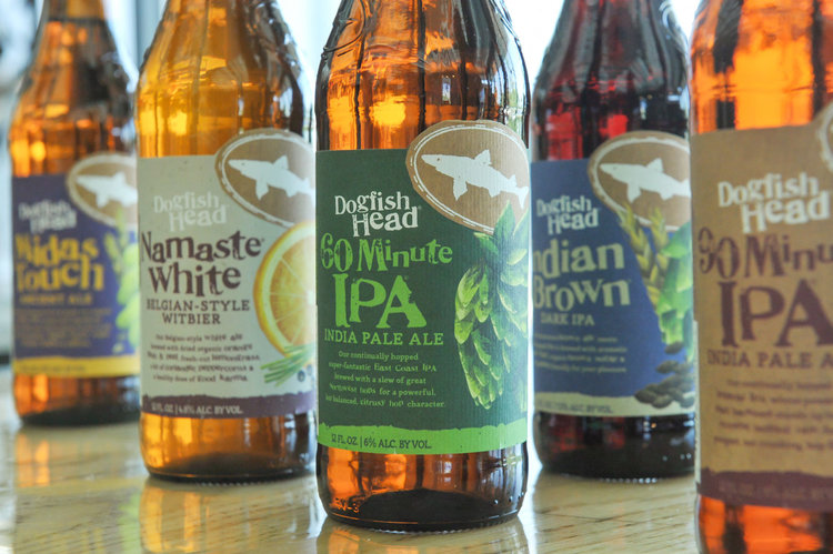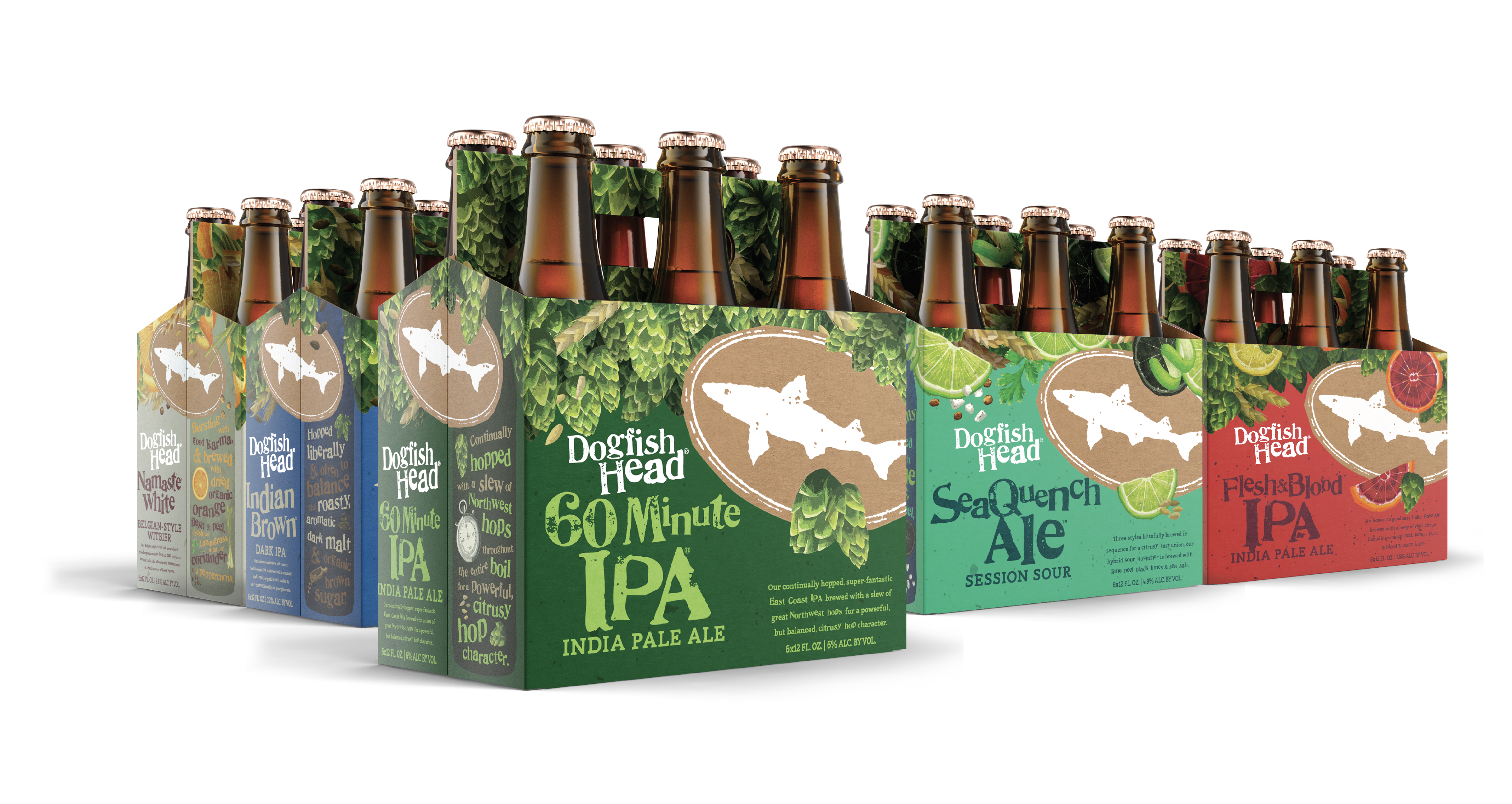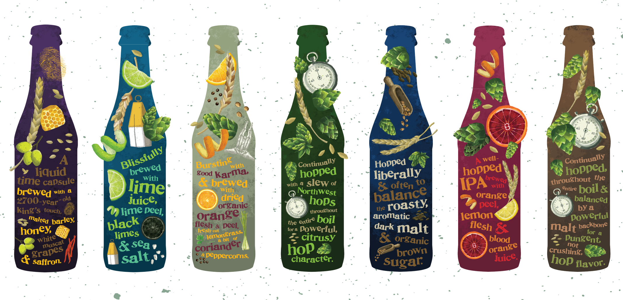
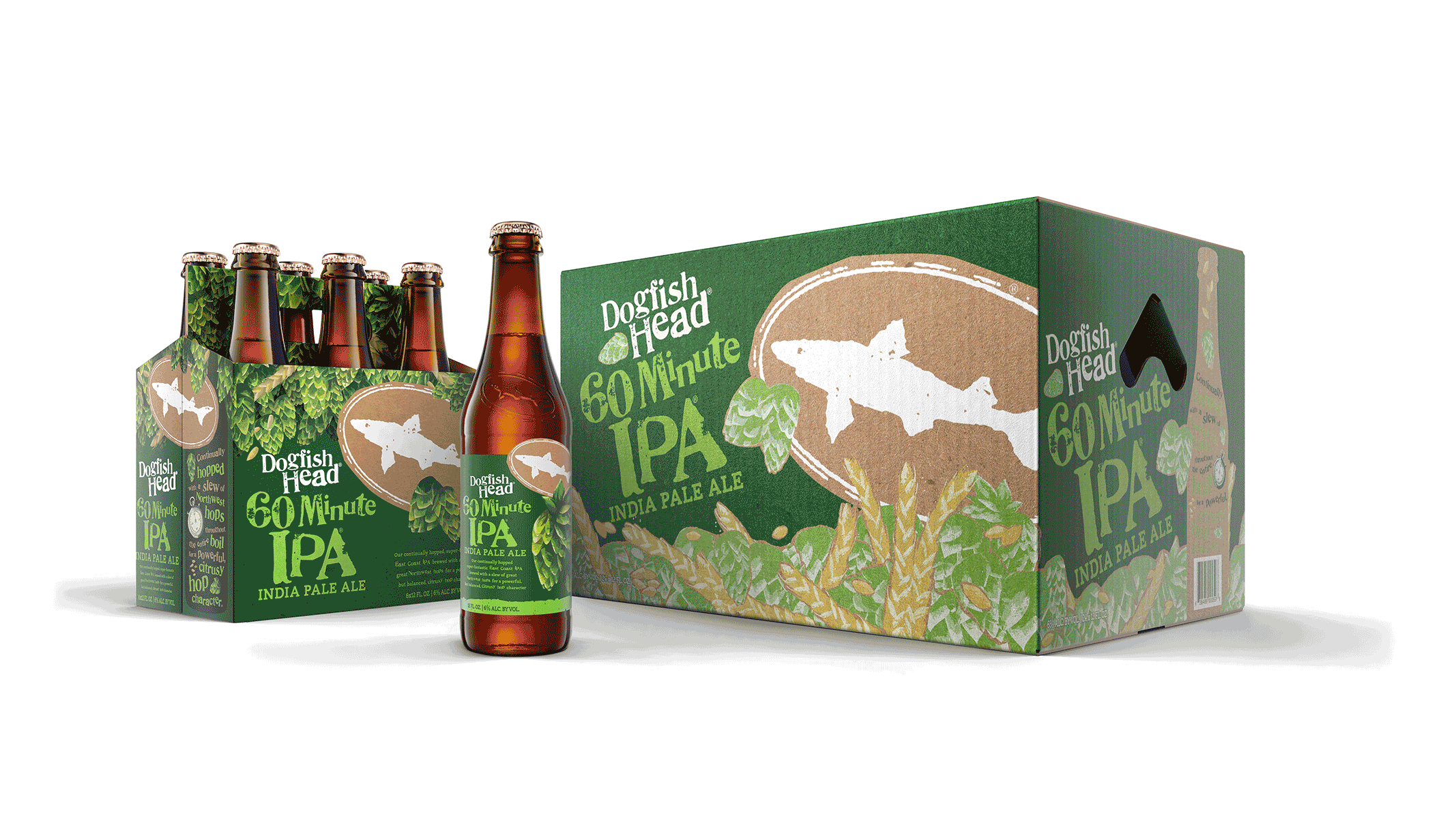


I was brought on to help develop design strategy and establish the visual architecture for a rebranding effort that aimed to bring continuity to a vastly sprawling brand while maintaining character and credibility within a savvy craft beer market. After weeks of collaboration with the client team, the solution chosen involved bringing the ingredients to the forefront to create approachable and informative packaging.
“We’re putting our premise back inside the bottle [through] distinction of the recipe and ingredients. It’s the bull’s eye of that approach [that’s] outlined on every four- and six-pack,” said Calagione, owner of Dogfish Head.
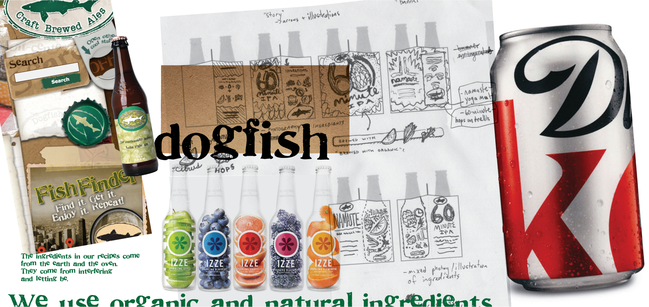
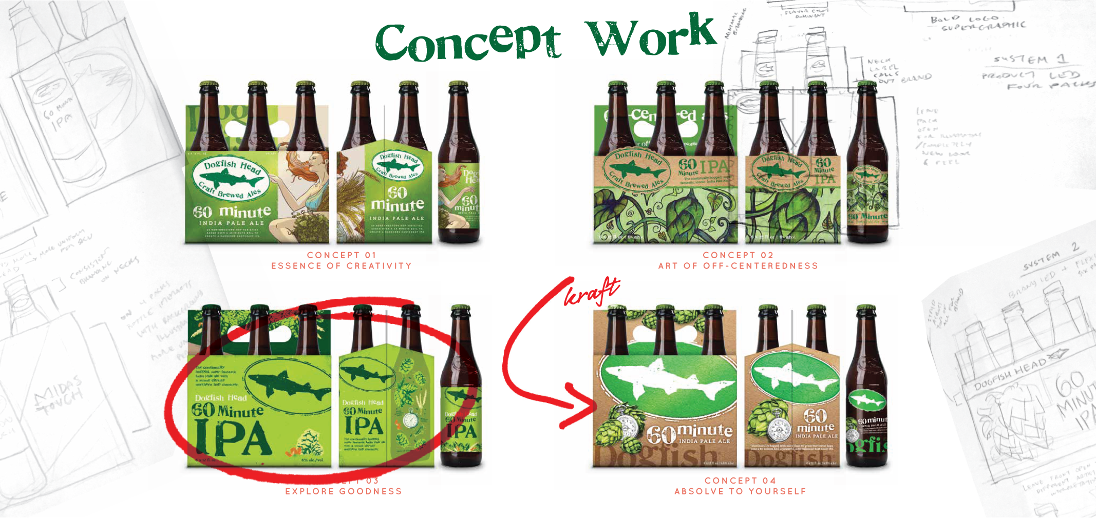
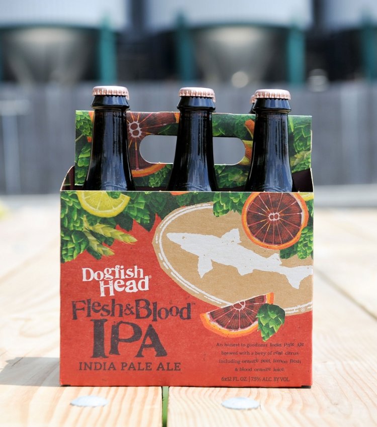
Although my design was chosen by Dogfish Head’s team, my contribution via freelance contract was cut short of final art optimization and production, but here is a look at my sketches, mocks and design theory that shaped the direction for the final layout, illustrations, mothercases, 6-pack and label designs that were established over the subsequent months.
(2015)
Client: Dogfish Head via Interact Boulder
Illustration: John Vogl